Landing page for Tatev Zipline
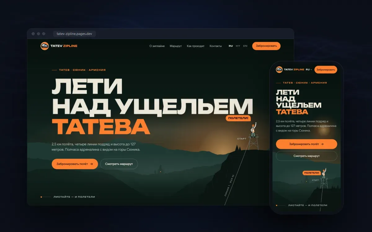
A website for the zipline over the Tatev gorge where scrolling is the flight itself. A rider slides along the cable through the whole page, from the starting tower to the booking button.
- Client
- Tatev Zipline
- Platform
- Website
- Role
- Concept, design, illustration, animation, development
- Languages
- Russian, English, Armenian
The problem
A zipline in Tatev sells an experience that is hard to put into words: half an hour of flight over the gorge, four lines in a row, the mountains of Syunik below. Visitors are tourists from different countries, and they decide in advance, on a phone, before the trip. The site had to let people feel the flight within a couple of minutes, answer the practical questions honestly — how long it takes, how it works, how safe it is — and lead to a booking in the guest's own language without extra steps.
The idea
The page is the flight. On the first screen the rider stands on the starting tower, and scrolling sends them down the cable. The cable runs through the entire site from tower to tower — four lines with the route's real lengths — and turns orange behind the rider. A live gauge shows the current line, the altitude and the metres covered out of 2,500. The finish tower sits right at the call to book: the visitor arrives at the decision together with the hero.
The solution
Everything needed to decide is built around the flight: big route figures, a gallery of flight moments, a map of the lines over the terrain, four steps from briefing to finish, and the other activities on site. Booking needs no forms: the button opens a choice of channel, and a call, WhatsApp or Telegram starts with a single tap. In WhatsApp the message is already written in the page's language — the guest only has to press send. The site is fully translated into Russian, English and Armenian, and marked up for search engines with tourist attraction structured data.
Approach
The visual language comes from the place itself: the dark green of the gorge, sunset orange, silhouettes of mountains and the monastery, a bold grotesque for headlines. The towers, the rider, the landscape and the icons are drawn as vectors and embedded in the page, so they stay crisp on any screen. Animation is built with GSAP and ScrollTrigger over Lenis smooth scrolling; for people who have reduced motion enabled, the site shows everything in its final state straight away. The mobile version is not a trimmed copy: the flight works the same, and the gauge turns into a compact strip under the header.
Outcome
The landing page is live in three languages. Guests understand the route, the duration and how the flight works before they call, and a single tap separates the last screen from a booking — with the message already written. We will share booking figures once there is enough data: the site has only just launched.
Shall we look at your process?
Tell us what eats the most time. We will see whether it can be removed — and if it cannot, we will say so directly.
Message us on Telegram